3.3. Theme Development
A “theme” in Makahiki consists of a specification of the background image (or color), as well as with the background and font colors for various structural elements of the system.
Users have the ability to select themes from the Profile page, making it unnecessary to develop a “perfect” theme for your challenge. We provide a variety of pre-built themes and allow developers to create additional ones, with the hope that all users will find at least one that appeals to them.
Makahiki’s themes are implemented using LESS, which is a kind of enhanced version of CSS that supports variables and other capabilities not available in standard CSS. We choose LESS for themes because that is the language used to implement the Twitter Bootstrap framework, which is also used in Makahiki.
Fortunately, you need to know nothing about Twitter Bootstrap and almost nothing about LESS to create Makahiki themes. Most developers should be able to create themes simply by copying and editing a pre-existing theme file, which is what this page will show you how to do.
The following sections provide a step by step guide to developing a new theme. These sections document the actual steps taken to develop the initial version of the “Google” theme.
3.3.1. Create a local installation
The first step in theme development is to follow the local installation guide to create a running implementation on your computer, as documented in Local installation of Makahiki.
3.3.2. Set environment variables for theme development
To simplify theme development, it is important to set the MAKAHIKI_USE_LESS and MAKAHIKI_DEBUG environment variables to true. When this is done, you can make changes to your theme file, save it, and then simply refresh the page to see the changes.
There are a variety of ways to set these environment variables, but a convenient way is to set them in the ~/.virtualenvs/makahiki/bin/postactivate file. This way, whenever you workon makahiki, the variables will be set. Here, for example, is the contents of my postactivate file:
#!/bin/bash
# This hook is run after this virtualenv is activated.

MAKAHIKI_DATABASE_URL=postgres://makahiki:makahiki@localhost:5432/makahiki
export MAKAHIKI_DATABASE_URL

MAKAHIKI_ADMIN_INFO=admin:admin
export MAKAHIKI_ADMIN_INFO

MAKAHIKI_USE_LESS=True
export MAKAHIKI_USE_LESS

MAKAHIKI_DEBUG=True
export MAKAHIKI_DEBUG
Once you have edited this file, you will need to workon makahiki again to set these variables. To verify they are set correctly, you can do the following:
% printenv | grep MAKAHIKI
MAKAHIKI_DEBUG=True
MAKAHIKI_DATABASE_URL=postgres://makahiki:makahiki@localhost:5432/makahiki
MAKAHIKI_ADMIN_INFO=admin:admin
MAKAHIKI_USE_LESS=True
3.3.3. Create your new theme file
The directory makahiki/static/less contains all of the files that define the Makahiki look and feel. All of the information required to define a new theme is specified in a single file named “theme-<theme_name>.less”. For example, some of the predefined theme files are: “theme-sonora.less”, “theme-wave.less”, and “theme-forest.less”.
To create your new theme file, simply make a copy of a current theme file, naming it with the name of your new theme. To start creating the Google theme, I will do the following:
% cd ~/makahiki2/makahiki/static/less
% cp theme-forest.less theme-google.less
To make the new theme, we will edit variable values in the theme-google.less file to suit our new look and feel.
3.3.4. Add your theme to the installed themes
In order for a new theme to be available to the system, you need to edit the makahiki/settings.py file and add your theme name to the INSTALLED_THEMES variable. Here is what this portion of the settings.py file looks like after I’ve added my new google theme to it:
##########################################################
# INSTALLED Themes. Please keep them in alphabetical order
##########################################################
INSTALLED_THEMES = (
    'theme-bubbles',
    'theme-forest',
    'theme-google',
    'theme-sonora',
    'theme-wave',
)
In other words, add the name of your new theme file, minus the ”.less” extension, to this list.
3.3.5. Verify your theme installation
It should now be possible to select your new theme in the system. To check, bring up the server by invoking the runserver command:
%  manage.py runserver
   Validating models...

   0 errors found
   Django version 1.4, using settings 'settings'
   Development server is running at http://127.0.0.1:8000/
   Quit the server with CONTROL-C.
Then browse to the development server, login, go to the Profile page, and select your new theme from the drop-down list in the My Info widget. Press “Save Changes” to install your new theme. The following figure shows a portion of the Profile page after choosing the brand new google theme:
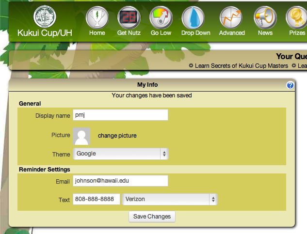
The newly installed Google theme after selection from the Profile page.
As you can see, there is a theme called “Google”, which the system named by capitalizing the text following “theme-” in the file name, and omitting the “theme-” prefix.
If your theme does not show up in the drop-down menu or if errors occur during display, seek guidance from a Kukui Cup developer.
Otherwise, you have now installed your new theme, and the next step is to actually make it look the way you want to.
3.3.6. Determine your color palette
All themes are based upon a set of complementary colors represented in RGB notation. How you come up with the color palette is up to you. In the case of our new Google theme, we will use the same colors that appear on the Google home page:

To determine those colors, we will use the Color Explorer Image Import page, where you can upload an image and it will determine the RGB colors present in that image for you.
After uploading the google home page image above, Color Explorer indicates the colors as follows:
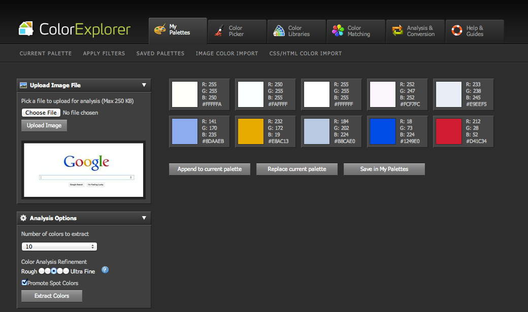
So, the RGB value for Google’s red color is #D41C34, the gold is #E8AC13, and so forth.
3.3.7. Specify your palette in your theme file
Now that we know the colors we want, let’s define them in the theme file. In our case, we will open the file theme-google.less in an editor, and near the top of the file we find LESS variable definitions for the twitter bootstrap and forest theme color palettes:
// Bootstrap color palette
@black:                 #000;
@grayDarker:            #222;
@grayDark:              #333;
@gray:                  #555;
@grayLight:             #999;
@grayLighter:           #eee;
@white:                 #fff;
@blue:                  #049cdb;
@blueDark:              #0064cd;
@green:                 #46a546;
@red:                   #9d261d;
@yellow:                #ffc40d;
@orange:                #f89406;
@pink:                  #c3325f;
@purple:                #7a43b6;

// Forest color palette
@forest-white:          #E9F2E4;
@forest-brightgreen:    #86B04C;
@forest-tan:            #A89B83;
@forest-lighttan:       #EBE8B9;
@forest-green:          #82A367;
@forest-gold:           #A18E4A;
@forest-purple:         #916981;
@forest-brown:          #635A49;
@forest-darkgreen:      #182608;

@forest-sgg-blue:       #671BE0;
@forest-sgg-orange:     #A33B0F;
@forest-sgg-green:      #7E9C08;
@forest-sgg-purple:     #A13B9D;
@forest-sgg-aqua:       #399E99;
@forest-sgg-darkaqua:   #074263;
The Twitter Bootstrap framework defines the first set of color variables, and these colors are occasionally used for UI elements. They are provided in every theme file so that if you want to override the default colors used by Twitter Bootstrap for your theme, you can do so. This is optional and we won’t worry about it.
The second set of definitions specify the colors used in the Forest theme. As you can see, to keep things simple, each theme defines a color palette using its own theme name. The next step is to add our new color palette variable names right below the Forest color palette:
// Bootstrap color palette
@black:                 #000;
@grayDarker:            #222;
@grayDark:              #333;
@gray:                  #555;
@grayLight:             #999;
@grayLighter:           #eee;
@white:                 #fff;
@blue:                  #049cdb;
@blueDark:              #0064cd;
@green:                 #46a546;
@red:                   #9d261d;
@yellow:                #ffc40d;
@orange:                #f89406;
@pink:                  #c3325f;
@purple:                #7a43b6;

// Forest color palette
@forest-white:          #E9F2E4;
@forest-brightgreen:    #86B04C;
@forest-tan:            #A89B83;
@forest-lighttan:       #EBE8B9;
@forest-green:          #82A367;
@forest-gold:           #A18E4A;
@forest-purple:         #916981;
@forest-brown:          #635A49;
@forest-darkgreen:      #182608;

@forest-sgg-blue:       #671BE0;
@forest-sgg-orange:     #A33B0F;
@forest-sgg-green:      #7E9C08;
@forest-sgg-purple:     #A13B9D;
@forest-sgg-aqua:       #399E99;
@forest-sgg-darkaqua:   #074263;

// Google color palette
@google-white:          #FFFFFF;
@google-offwhite:       #E9EEF5;
@google-lightblue:      #8DAAEB;
@google-gold:           #E8AC13;
@google-lightlightblue: #B8CAE0;
@google-darkblue:       #1249E0;
@google-red:            #D41C34;
As you can see, the color palette for the Google theme is smaller than for the Forest theme. That’s fine: there’s no standard number of colors for a palette. You will see below that there are ways to produce new colors by lightening and darkening the palette colors if that is desired.
The following steps will incrementally replace the Forest theme colors for various components of the site with our new Google palette colors.
3.3.8. Define the background theme
The background for a Makahiki site can either be an image or a color. In the Forest theme, and image is used so the use-bkg-image variable is set to true, an image is specified, and the background color variables are commented out:
// Page Background
@use-bkg-image: true;
@page-bkg-image: "../images/forest-theme-background.jpg";

// Since background image is used, these values are not needed.
//@page-bkg-color-start: @forest-gold;
//@page-bkg-color-end: lighten(@forest-gold, 10%);
Images should be stored in makahiki/site_media/static/images. By convention, name them <name>-theme-background.jpg, and make sure they are small in file size (around 50 KB).
The background for the Google theme is (you guessed it), white. So, we change these definitions so that use-bkg-image is false, and provide white as the background color:
// Page Background
@use-bkg-image: false;
// @page-bkg-image: "../images/forest-theme-background.jpg";

@page-bkg-color-start: @google-white;
@page-bkg-color-end: @google-white
Note
Defining gradients with “start” and “end” variables.
Several of the theme color elements (such as page-bkg-color) are specified as pairs of variables with a “-start” and “-end” suffix. This means that it is possible to define that element as a gradient, where the element has the start color at the top, and transitions into the end color at the bottom. If you do not want a gradient, simply specify the same color for both start and end (as is shown above).
Once we’ve made the change and saved the file, all we need to do is refresh the page in a browser to see the change:
As you can see, the background is now white.
3.3.9. Define the Navigation Bar theme
The next element of the theme I want to tackle is the navigation bar. I’m going to try making it blue:
// Navbar
@navbar-bkg-color-start: @google-darkblue;
@navbar-bkg-color-end: lighten(@navbar-bkg-color-start, 30%);
@navbar-font-color: @google-white;
@navbar-curr-page-bkg-color: @navbar-bkg-color-end;
@navbar-curr-path-font-color: lighten(@google-gold, 20%);
@navbar-transparency: 0%;
In this case, I will use a gradient for the navigation bar background, where the end color will be the start color lightened by 30%. The variables also enable you to highlight the current page. Since there is no background color, I set transparency to zero. Here’s what the new blue nav bar looks like:

3.3.10. Define the Info Bar theme
The top element in the page is called the “Info Bar”. Since Google is a very minimal style, let’s just make it offwhite:
// Infobar
@infobar-bkg-color-start: @google-offwhite;
@infobar-bkg-color-end: @google-offwhite;
@infobar-font-color: @black;
@infobar-feedback-font-color: @black;
@infobar-transparency: 0%;
Here’s the result:

3.3.11. Define the Quest Bar theme
We’ll make the Quest Bar the same as the Info Bar:
// Questbar
@questbar-bkg-color-start: @google-offwhite;
@questbar-bkg-color-end: @google-offwhite;
@questbar-font-color: @black;
@questbar-transparency: 0%;
Here’s the result:

3.3.12. Define the widget theme
To continue with simplicity mode, I am going to define the widget title background with a light blue top. Subelements of the widget will just use slight variants of these colors:
// Widgets
@widget-title-bkg-color-start: @google-lightblue;
@widget-title-bkg-color-end: @google-lightblue;
@widget-title-font-color: @black;
@widget-title-transparency: 0%;
@widget-body-bkg-color: @google-white;
@widget-body-font-color: @black;
@widget-body-transparency: 0%;
@widget-button-bkg-color: darken(@widget-body-bkg-color, 50%);
@widget-button-font-color: @widget-body-bkg-color;
@widget-table-row-color-1: @widget-body-bkg-color;
@widget-table-row-color-2: lighten(@widget-body-bkg-color, 40%);
@widget-subtitle-bkg-color: lighten(@widget-title-bkg-color-start, 20%);
@widget-subtitle-font-color: @black;

@widget-text-area-bkg-color: @google-offwhite;
@widget-text-area-font-color: @black;
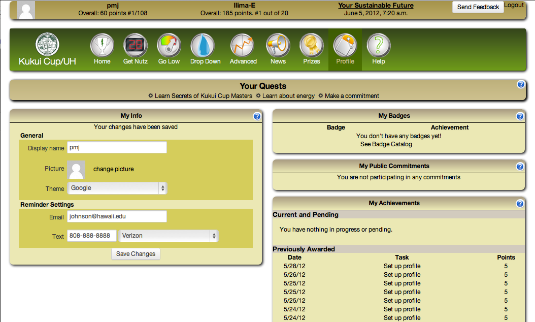
Here’s what the whole profile page looks like at this point:
3.3.13. Define the notifications theme
When users accomplish actions or various events occur in the game, the system informs users via dismissable notification windows that appear just below the Quest Bar on all pages.
We’ll make these gold so they stand out:
// Notifications
@notification-bkg-color-start: @google-gold;
@notification-bkg-color-end: @google-gold;
@notification-font-color: @black;
@notification-transparency: 0%;
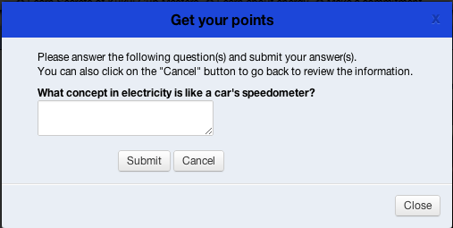
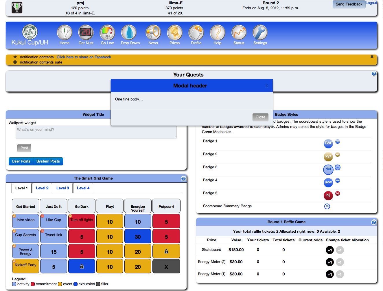
3.3.14. Define the modal dialog box theme
Modal dialogs are used in various places on the site to focus user attention on a task that must be accomplished immediately before doing anything else.
A quick way to see a modal dialog during theme development is to click into any unfinished action in the Smart Grid Game and press the “I did this” button.
We will make our modal dialogs with a blue title bar and light blue background:
// Modal dialog box
@modal-title-bkg-color-start: @google-darkblue;
@modal-title-bkg-color-end: @google-darkblue;
@modal-title-font-color: @black;
@modal-body-bkg-color: @google-offwhite;
@modal-body-font-color: @black;
Because they are modal, to see the affects of your change, be sure to go back to the Get Nutz page and re-enter the action page. Just re-clicking the “I did this” button will not revised the formatting.
Here’s what the modal dialog looks like:
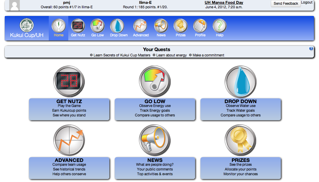
3.3.15. Define the Info Box theme
The Home Page contains large versions of the Navigation Bar icons that are annotated with explanatory text. Let’s style these as follows:
// Home Page Infobox
@pageinfobox-bkg-color-start: @google-lightblue;
@pageinfobox-bkg-color-end: @google-lightlightblue;
@pageinfobox-font-color: @black;
@pageinfobox-transparency: 0%;
Now the home page looks like:
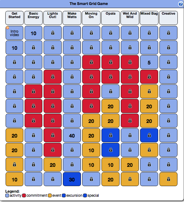
3.3.16. Define the Smart Grid Game theme
Let’s introduce some color into the Smart Grid Game:
// Smart grid game
@sgg-header-bkg-color: @google-offwhite;
@sgg-header-font-color: @black;
@sgg-entry-font-color: @black;
@sgg-activity-cell-bkg-color: @google-lightblue;
@sgg-commitment-cell-bkg-color: @google-red;
@sgg-event-cell-bkg-color: @google-gold;
@sgg-excursion-cell-bkg-color: @google-darkblue;
And it looks like this:
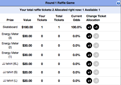
3.3.17. Define the Raffle Game Theme
It is possible to set the Raffle Game entry color. Let’s just make it black:
@prizes-raffle-table-entry-color: @black;
With this result:
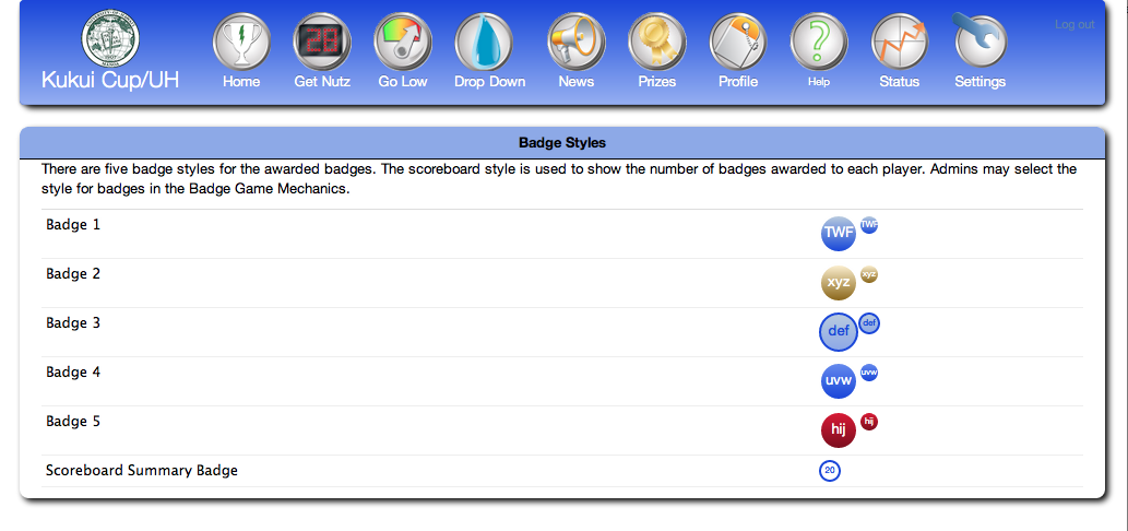
3.3.18. Define the Badge themes
Makahiki comes with six predefined badge themes, which are specified in terms of a start and end color for the badge background, and a color for the text that appears inside the badge and for the outline color. Here’s what the definitions for the google theme look like:
// Badges
@badge-theme-1-bkg-color-start: @google-lightlightblue;
@badge-theme-1-bkg-color-end: @google-darkblue;
@badge-theme-1-text-color: @google-white;

@badge-theme-2-bkg-color-start: lighten(@google-gold, 40%);
@badge-theme-2-bkg-color-end: darken(@google-gold, 20%);
@badge-theme-2-text-color: @white;

@badge-theme-3-bkg-color-start: @google-lightlightblue;
@badge-theme-3-bkg-color-end: @google-lightblue;
@badge-theme-3-text-color: @google-darkblue;

@badge-theme-4-bkg-color-start: lighten(@google-darkblue, 20%);
@badge-theme-4-bkg-color-end: @google-darkblue;
@badge-theme-4-text-color: @white;

@badge-theme-5-bkg-color-start: @google-red;
@badge-theme-5-bkg-color-end: darken(@google-red, 20%);
@badge-theme-5-text-color: @google-white;

@badge-theme-summary-bkg-color-start: @google-white;
@badge-theme-summary-bkg-color-end: @google-white;
@badge-theme-summary-text-color: @google-darkblue;
To see the results, you have to navigate to the special page “badge-display”, which looks like this:
3.3.19. Define the default font and link colors
Once the page is mostly done, go back to the top of the file to specify the default font and link colors through the following definitions:
@page-font-color: @black;
@page-link-color: @google-darkblue;
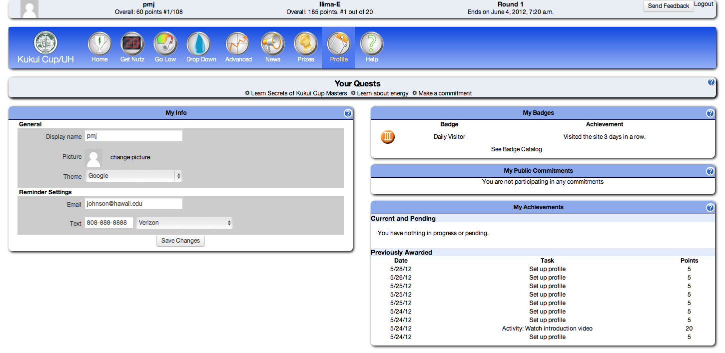
In most cases, you will want the link color to be different from the font color so that textual links stand out. Pages like Profile contain links, so you can check to see that the link text stands out on this page.
To see your the results of your theme, you can navigate to the special page “theme-display”. It has all of the theme-able elements in a single page.
3.3.20. Seeing everything at once: the theme-display page
If you want to see virtually all of your theme’s elements in a single page, retrieve the “theme-display” page, which looks like this:
3.3.21. Cleanup: Delete the prior theme’s variable definitions
Once you have gone through and replaced all references to the old theme’s palette colors, delete these definitions from the top of the file. In this example, I will delete all of the “forest” color definitions.
After deleting, I do a quick search of the file to make sure no strings beginning with “forest-” exist, just to make sure I haven’t left a reference to an undefined theme variable in the file.
Leave the Twitter Bootstrap color definitions in the file, of course.
3.3.22. Create a compiled (CSS) version of your theme
During development of the theme, it is convenient for the page to load the .less file and compute the actual CSS directives on the fly. This allows you to edit the .less files and see the changes simply by reloading the page.
For production use, it is preferable to have a single CSS file containing the results of compiling all the associated .less files. This can be retrieved once and the locally cached file can be then referenced for all pages.
Once you are satisfied with your theme, you can create the compiled version via the compile_less script, which can be invoked as follows:
% scripts/compile_less.py
Note
Installing the lessc compiler
For the above script to run, you must have the lessc compiler installed. On Mac OS X, the following suffices:
$ brew install node
$ curl http://npmjs.org/install.sh | sh
$ npm install --global less
At least, sometimes. During a June, 2012 installation on Lion the installation of node failed. To fix it, I followed the directions in https://github.com/mxcl/homebrew/issues/11216, where it was suggested to:
sudo xcode-select -switch /Applications/Xcode.app/Contents/Developer
If this seems like too much hassle, just inform the Makahiki Development Team that you have developed a new theme and would like it compiled, and one of them will do it for you.
3.3.23. Push your changes
The final step is to use git to add your new theme file and push your changes (including the updated settings.py).